
I’ll never understand why this “new/green dot” thing exist, but I’ll also never understand why it would bother anyone. lol. Like, it’s in kick-off. How often are you scrolling through kick-off? Does anyone keep that menu open at all times that it triggers your OCD seeing it? Am I missing something? Or is it just people seeking attention?
When I install a new application, I generally run it immediately. Having the new indicator might be nice to help find it - they don’t always drop into the menu where I expect.
I agree, I can’t see why it upsets the author so much. “You’ve installed a new app, here it is.” “YYYEEEAAAARRRRGGGGHHHHHHH!”
It’s open source, you can remove it yourself BTW
Thing like this are why there’s a million settings in KDE; every dev is prepared for the inevitable “but I hate it, make it go away” complaint. Granted, this complainer was pretty respectful and threw in a donation to soften the blow. Most people just act entitled, like the dev personally affronted them with their update.
I will take a million settings over GNOME’s super-simplified “our way” approach any day
This has always been my attitude towards KDE. “At least I have the option”. Gnome is pure depression.
For every change there is an angry Linux user. Even when it is easily disabled and never a problem again.
On the flip side - how often do you install new programs so this becomes an annoyance in the first place?
I install something new maybe once a month or less for desktop use. I have not even noticed this blip.
Somewhat more often in and for terminal use.
I think it’s still an interesting question whether this feature should be enabled by default (and most people seem to agree it should be).
If it wasn’t on by default, the kind of person who would benefit from it wouldn’t discover it.
The kind if person who would benefit from that shouldn’t be using a computer. But then again, most smartphone users shouldn’t be using a phone. How about choosing different default settings in an installation based on a central “expert” vs “newbie” setting?
People who find computers useful should be using computers.
This weird idea from some linux users that only people who see their computer as a hobby and have mastery over them should be allowed to use them, and that computers should be designed exclusively around the needs of computer-as-hobby users, is absolutely nuts.
Its a tool. It should be designed to be useful as possible to anyone who needs such a tool.
Sincerely,
Another linux user who cares about UI/UX and is tired of this kind of junk. It’s a dumb argument, let’s all stop making it please. Linux supports all your “technical user” wildest dreams, let the average people have their features and design considerations too.Its a tool. It should be designed to be useful as possible to anyone who needs such a tool.
Twenty years ago I might have agreed. Now, in hindsight, I can say that giving everyone access to computers & thereby the internet has brought out the worst in humanity, including mass-manipulation and authoritarian regimes thanks to people making even worse calls in elections than they used to.
The devil is in how things are made useful to users who just want to get things done. The problems comes with corporations making decisions about what users should need to understand, and what users want. There’s been a lot of dumbing down and manipulation in that process, serving the needs of those corporations and advertisers and not the needs of the users.
Software can be made useful for those who don’t want or need to undertand all the details, in a good, non-harmful way. The principle of separation of interface and implementation even demands it. But our society being what it is, that largely doesn’t happen, so I’m inclined to agree with your pessimistic take.
This is really getting that “old man screams at the cloud” vibe.
Are you okay?
I recently installer something, and KDE showed me where it ended up in the launcher, which I appreciated, and now I’m not supposed to use a computer. Really? Thanks.
At least me wife will be happy, but I’ll need to find new work.
Oh. You’re one of them. I can safely ignore you.
What qualifies as “expert” setting can be very divisive… for me, it would be removing this menu entirely. Or even switching from KDE to sway or similar ^^U
But if I was the kind of people that do use this kind of menus I would probably find that kind of indication useful. It helps finding the category the app you just installed belongs to. If you install an educational app/game that teaches programming by giving instructions to a turtle in order to draw a graphic/picture (I think I have seen something like that before): which category should it be at? games? education? development? graphics?
My main point is: If the desktop environment “expert” toggle is set once, gimmicks like this one here would be disabled by default. On a default installation, with the “expert” toggle to “off”, those same gimmicks might be enabled by default.
Welcome to a future of forever arguing which features are gimmicks.
This one, for example, is not.
Everything in the desktop is a gimmick… remove all visible things of the desktop and only show apps. Settings can be handled in a text configuration file. Or are some of these gimmicks actually useful, even for “experts”?
I have many times, installing a new app on a Windows Server, just gone in and seen the latest installed app and clicked on it. Sorry, that is my best example as that is where I most often use this feature - I don’t install that many apps on my desktops.
I was very annoyed when I got this, but remembered that it’s KDE, and turning it off is 4 clicks. Proprietary software often doesn’t allow you to turn this off (easily). Windows has this “feature”, where is the setting?
I don’t think it’s a productive “feature”, but considering it can be turned off so easily I don’t consider it a complete showstopper.
I find KDE’s settings app isn’t always easy to find settings in, especially when you have no idea what to call a feature.
This! KDE’s settings are a mess to navigate. I completely understand why that person didn’t know there even was a configuration for this.
Windows has this “feature”, where is the setting?
I’m assume youre talking about W11?
Because the “Show recently added apps” setting is third option in the start menu settings on W10.
The main issue is UX imo. On Windows 11, it’s “5 clicks”, but you have to open the settings app and find the setting two submenus deep. On KDE, it’s right click > configure application launcher > toggle setting > apply.
Yeah, for some reason they’ve seemed to made it harder to find the actual start menu settings instead of more generic taskbar settings. So that’s a fair point.
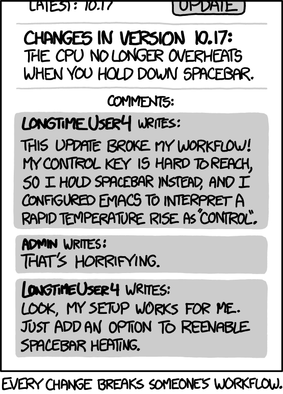
It sounds like the author of the article is more concerned with the incentive it creates for developers to push useless or sloppy updates (“impact driven development”) than the UX.
How does this give incentive for that?
My understanding is that this only happens in newly installed apps, not recently updates ones. They are only highlighted because the user installed them, not because the developer did anything.
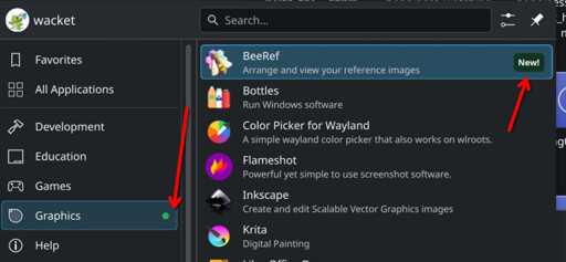
It’s a screenshot of the application launcher, the menu to launch apps already installed, not the software store.
My mistake if that’s the case.
This kind of bullshit shouldn’t ever be on by default. KDawful reminds me again why I ditched it for XFCE.
I think it’s a great feature. I can now quickly find the thing I just installed in my menu.
Yeah. Plus they immediately got a reply from someone showing where you can turn it off in settings.
I find this complaint very strange. It’s a dot. It helps people find what they installed.
But if this person doesn’t need it, how would they ever see it? Most power users I know never even look in the menu, so they would never know there is a dot in the first place.
Strange complaint.
It’s all a show. Some people are just desperate for attention. “Oh, look at me, I’m OCD” as if that makes them cool or something. This person just spent €100 for literally nothing (glad it went to kde of course). Being annoyed by this is, IMHO, very stupid. It’s a menu that can’t even stay open. Who’s sitting there sifting their menu all day long that this bothers them? 😂
I’m glad there’s a toggle, it seems like it would actually be useful here but I’d probably turn it off.
With that said, there’s a special place in hell for the multitudes of apps that have red notification dots all over the UI with no clear indicator as to what they’re about or how to clear them :D
Yeah, I hate those little dots and I inevitably jump through the hoops until I’ve clicked enough things to make them go away.
Lol does that mean he should donate the second 100€
He said “I’ll donate 100 EUR if you remove”, so I think he may be obligated to donate every single time this option is disabled.
Funny little read there.
I know 3 people that get mad at me when I don’t clear the dot for new inventory/lore items in video game menus by scrolling over each one
There is a setting, but I was equally annoyed that it is on by default.
Even more surprising - when I launched the new app miltiple times, it was still marked as new.
It’s probably time based.
And this kind of thing isn’t for the type of people who mess with settings. If this defaulted to off, then it would actually be useless.
If this defaulted to off, then it would actually be useless.
Would just be the other way around with what posts you see online. Instead of OP you’d see “how can I find my newly installed apps” and the same “ahem” screenshot reply.
Except that if people don’t know the feature exists, they might not ask about it. If you see the feature exists and you don’t want it, it is easier to figure out how to turn it off.
There are many feature that are turned on by default - this is just one of them.
I see plenty of posts here, on the kde matrix, on the kde forums, on the bugtracker asking for non existing features.
I have no clue about the exact percentages, their motivations or feelings, so it’s hard to conclude anything.
Personally, I more often ask for nonexistent features (and i feel no barriers there) than turning off something that is on by default - which is a good sign I guess?
Hahaha, what a great way to start tuesday morning.
deleted by creator
Some apps have weird names and I forget what they’re called. Showing a “new” badge, even if it’s just for the first few times I open the app, makes it more likely that I’ll remember the app’s name.
deleted by creator
You can set most KDE menus to show the “Comment” key of the .desktop files instead of the “Name” key. So “KDE Advanced Text Editor” instead of “Kate”.
Packages can come with several “programs” that aren’t necessarily named the same as the package. Example: Calibre installs menu items for “Calibre”, “EBookViewer” and “EBookEditor” on my distro.
It’s not about forgetting…it’ about helping to quickly find what you just installed and what is all included.
OP specifically said “forget”, that’s what I was referring to.
I dunno man.
It’s not like linux applications ever have different app-names in the menu, when compared to the package name you just saw when installing it.
That has never tripped me up. No. Never.
/S
I install graphical and visual design apps. And I’ll navigate to the category by mouse. I don’t memorise the names of all my apps. I’m not in IT, and I’m not working with text all the time. I’ll right click the app icon and go ‘Add to favourites’, so I have a highly productive, 1 click access to important apps. I’m interested in usability, am not a beginner and I know my UI and settings well. I can see why people find this tiny green dot useful. It’s OK if you are not into usability. But note that there are many different user types, with different needs at different times. And the flexibility of KDE Plasma makes it a really great desktop environment.
deleted by creator
Sound like a really nice person /s
It’s more about which category a particular specific software belongs. If a kid installs an educational app/game that teaches programming by giving instructions to a turtle in order to draw a graphic/picture (I think I have seen something like that before). Which category should it be? games? education? development? graphics?
I personally don’t use this kind of menus with categories, I prefer dmenu style launchers where you type to search what you need. But if I was the kind of people that do use these kind of menus I would probably find that kind of indication useful.
You are right, the marker at the category level definitely makes sense to find the application initially.


